Lab 3 - Experimenting with color
This lab focused on optimizing the use of color. It is such a salient feature/property, that we need to be careful how we use it to convey information in a visualization. Color may be one of the first encodings that leave an impression on the viewer, and could easily lead to confusion (or just be distracting and not be useful).
This lab helped me understand the utility of gray scale, and how we can operate within its constraints when color is not an option (or should not be used for clarity).
Challenge #10
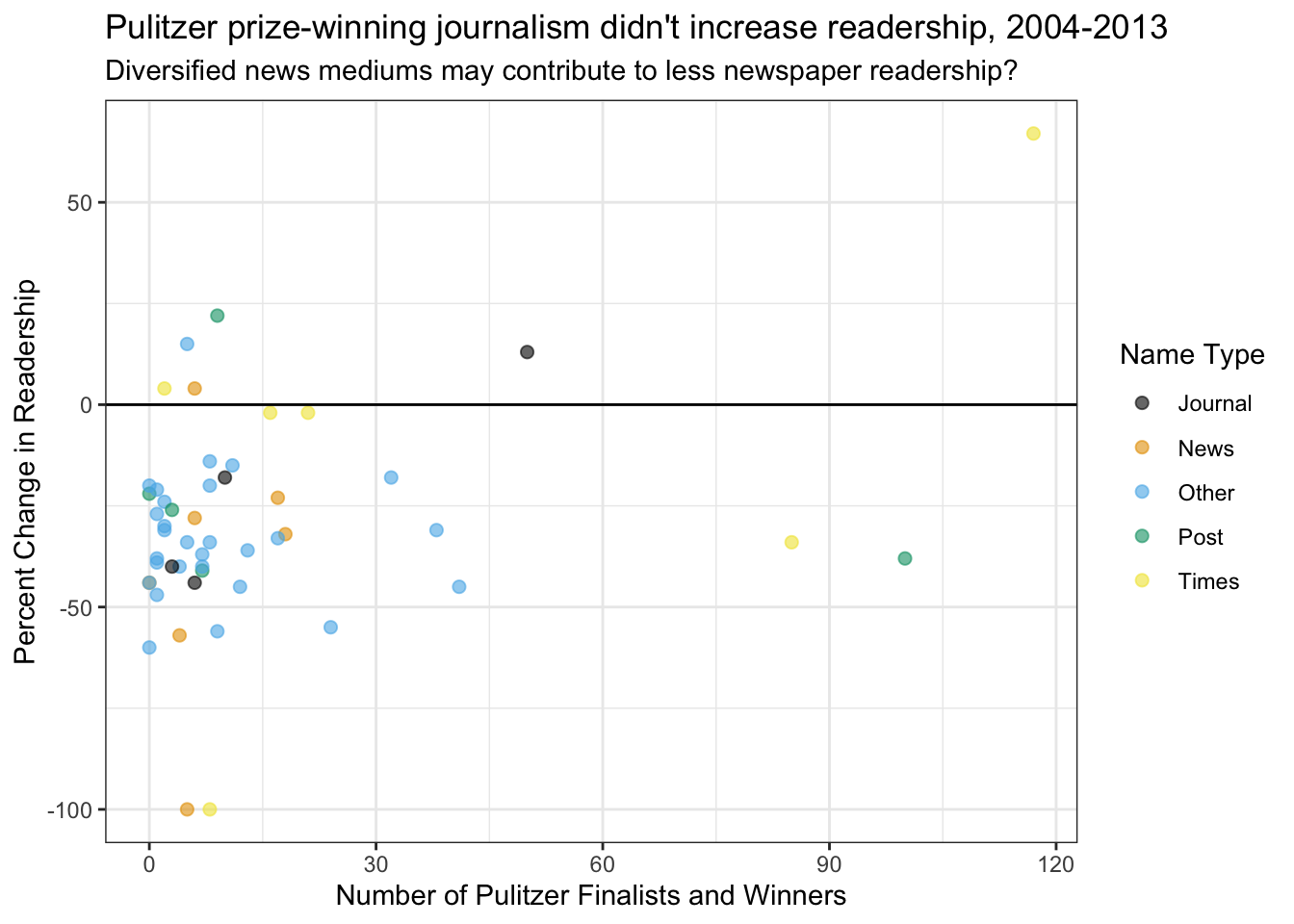
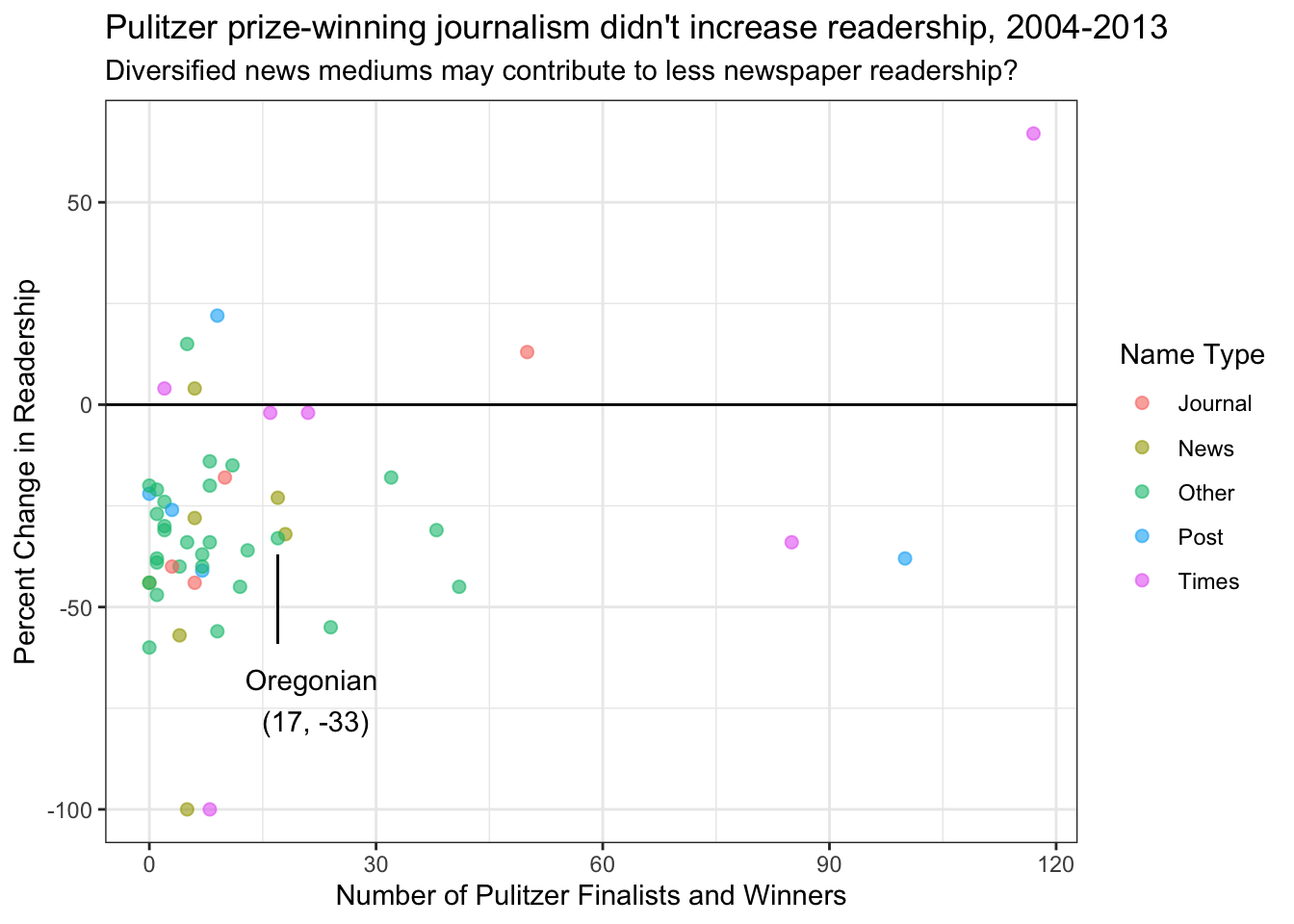
Version with good color
I think science communication is especially important, and one important facet of that is journalism. When I was looking for data for this challenge, I found a data set from 538 with information about Pulitzer prizes and changes in individual newspaper readership over a decade. It is a small enough data set that was assembled by Nate Silver. I thought it would be interesting to see if there was a relationship between the number of Pulitzer prizes nominated or won, and change in newspaper readership (particularly relevant). I was also curious to see if the name of the newspaper had any role because many people immediately think of papers like the New York Times, Washington Post, etc.
I will color each journal’s data point by it’s “name type,” which is a categorical variable without order. Since it is a discrete and unordered variable with fewer than eight categories, I will use the colorblindr palette.
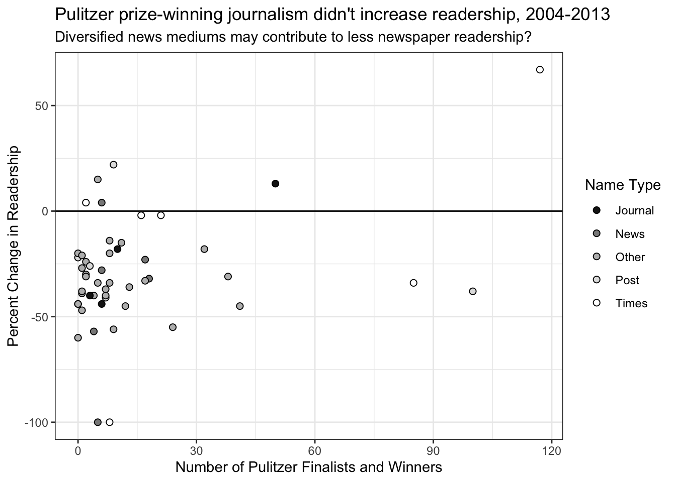
Version with greyscale
I don’t believe that greyscale does the best job for this plot by itself because of how the data points cluster in the bottom left.
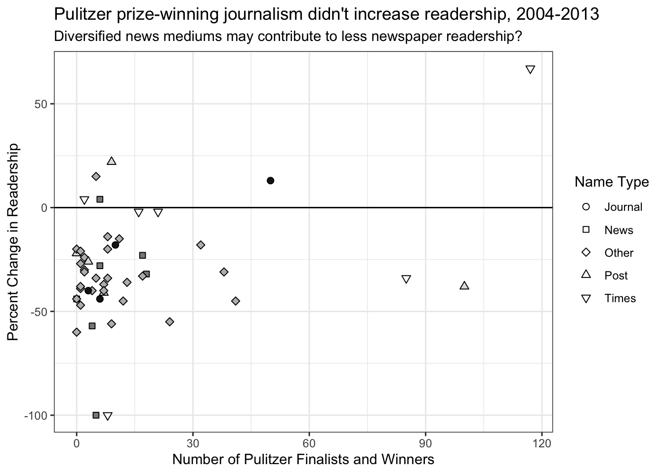
Doing this plot again, but this time adding point shape to differentiate points better within greyscale.
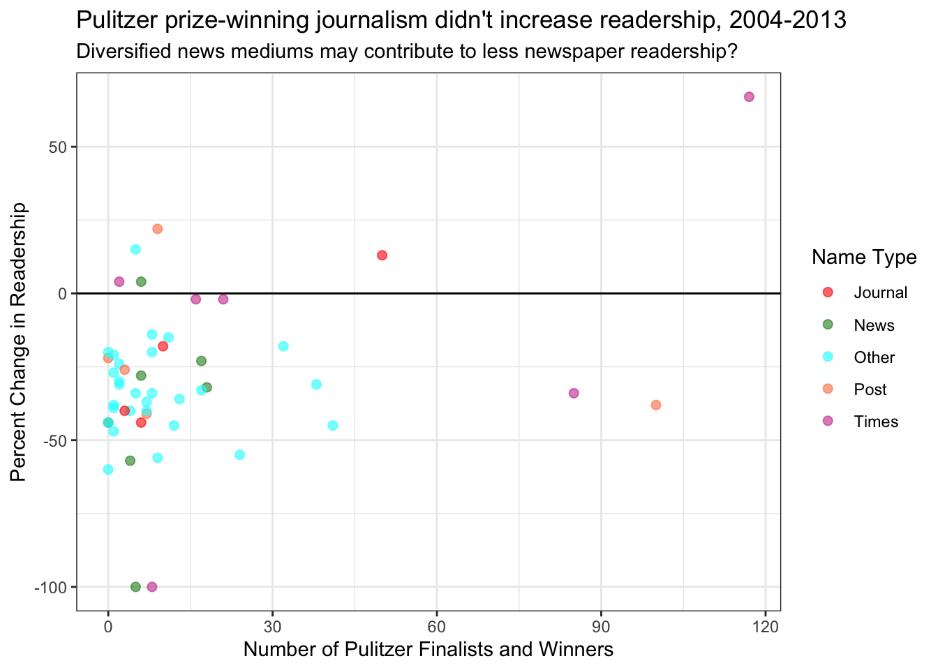
Version with dreadful color
This color palette breaks a few guidelines (which makes it bad):
- Contrasts red and green which is not color-blind friendly.
- Uses colors of varying luminances/vibrances.
- Applies similar or “ascending/descending” tones to a non-ordinal scale.
Curious about the Oregonian
I was curious about where Portland’s local paper, the Oregonian ranked, so I annotated it on this graph.
This post was excerpted from Lab 3 of BMI 625