library(readxl)library(gapminder)library(DT)# get a copy of the data to mutate/play withmy_gap<-gapminder
Excerpted Analysis from Data Wrangling Lab
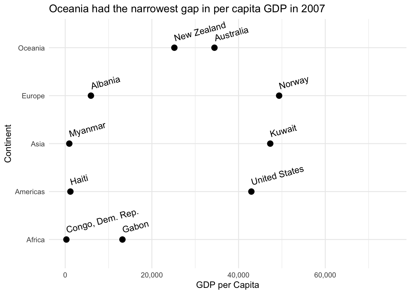
What is the maximum and minimum GDP per capita for each continent from the Gapminder dataset?
1
2
3
4
5
min_max_gdp<-my_gap%>%filter(year==2007)%>%# trying to only make comparisons across one point in time, most recent is 2007group_by(continent)%>%arrange(gdpPercap)%>%slice(1,n())
Table
The table is nice because it provides a lot of information about the countries involved, and enables the viewer to make some of their own inferences. However, I think some of the impact in the differences of wealth gaps (or life expectancy) lose their impact among the numbers. A visualization would be useful here to isolate a singular point and drive it home.
1
2
3
4
datatable(min_max_gdp,colnames=c("Country","Continent","Year","Life Expectancy","Population","GDP per Capita"))
min_max_gdp%>%ggplot()+aes(x=continent,y=gdpPercap)+geom_point(size=3)+geom_text(aes(label=country,hjust="left"),nudge_x=0.2,nudge_y=0.2,angle=15)+scale_y_continuous(limits=c(0,75000),labels=scales::comma)+labs(x="Continent",y="GDP per Capita",title="Oceania had the narrowest gap in per capita GDP in 2007")+coord_flip()+theme_minimal()
Description/Writeup
I decided to focus this visual on the differences between each continent’s highest and lowest GDP per capita countries. I think a scatter plot/point graph is appropriate because I will be able to compare both countries from each continent linearly, without needing to stagger their values (in say, a bar graph). The linear comparison should emphasize the differences (or lack thereof), and facilitate comparison across each continent (with an “implied bar” kind of like a gestalt principle).