Jelle’s Marble Runs and Marbula 1
Jelle’s Marble Runs is a YouTube channel that features a variety of marble racing events and competitions, with intricate tracks and colorful marbles. The channel exploded in worldwide popularity and received sponsorship from Last Week Tonight with John Oliver in 2020 when sports and spectatorship were oh hold during the Covid-19 pandemic.
Among their most exciting series is Marbula One, a racing championship modeled after the eponymous Formula 1 where marbles representing different teams compete in a series of high-speed (and adrenaline-pumping) races. Each race in Marbula One consists of two days of competition. On the first day (called “qualification”), marbles run (roll?) the track one at a time to see which goes fastest and set the order for the actual race. The second day of competition is the grand prix (race) itself.
Jelle’s Marble Runs feature engaging commentary and high-level production quality, which makes Marbula One and other events fun and exciting to watch. The channel has turned marbles into unexpected sports icons and created a uniquely entertaining experience for viewers of all ages.
The DATA
Description of the DATA you used (either given to you or where you found it, what unique characteristics of the data, what quantitative and qualitative information is in the data set, etc.)
The data set I used is the Marbula One Open Data Repository and a data set curated by Dr. Randal Olson. The data sets span several excel sheets, and the open data repository has a separate documentation file. I used two data sources because the data for the first season of Marbula One in the repository was not in tidy format, while Dr. Olson had already formatted the first season’s data.
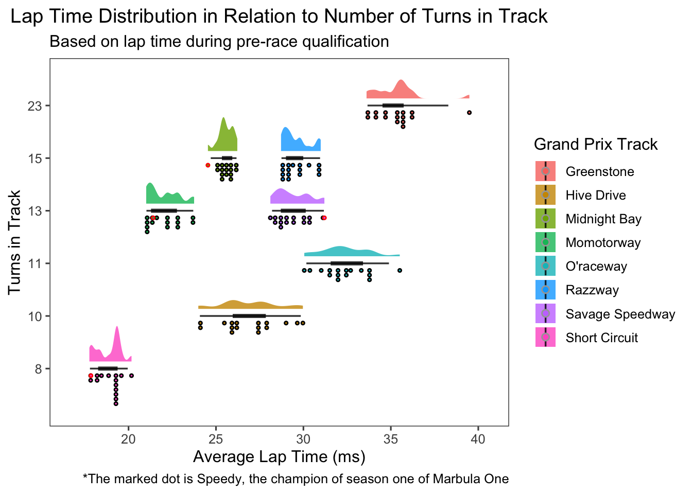
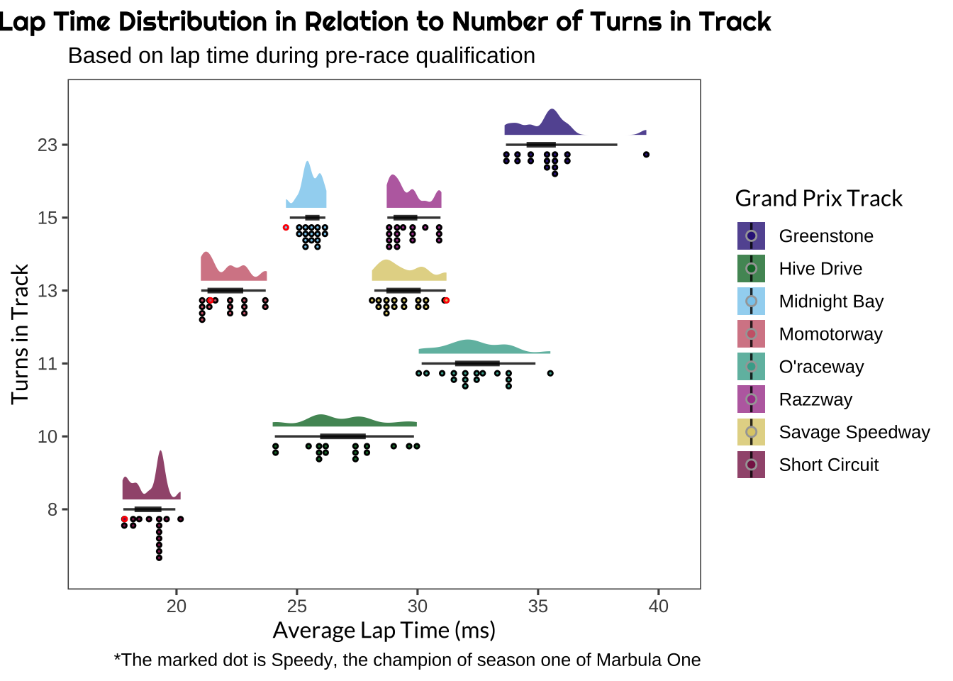
To make this visual, I combined the table with information about each of the racing tracks used during the first season with Dr. Olson’s tidy-formatted file, and filtered it to isolate just the data recorded during the grand prixs (and not the qualifying runs - though it would be interesting to examine that relationship as well).
The graphic uses three of the variables from the data set:
- The name of the race track (an un-ordered categorical variable).
- The number of turns in the track (this is discrete, so treated I treated it as an ordered categorical variable).
- The qualifying lap time on that track for each marble (continuous numeric variable).
Intended Audience
Description of the AUDIENCE you are aiming for (including more detail than simply saying “a biochemist”).
The intended audience is marble racing enthusiasts and Formula 1 fans who need something to tide them over until the next race (maybe also some curious physicists). This spans a variety of scientific or data-savvy different backgrounds, so it will be important to encode information clearly to avoid confusion.
Chart Type
Description of the TYPE of graph (e.g. Bar chart, Sankey Dendogram, etc).
I chose to use a raincloud plot to examine the distribution of lap times on different courses, and how that relates to the number of turns in the course.
Raincloud plots are hybrid charts consisting of a combination of box plots, [violin plots] (https://datavizcatalogue.com/methods/violin_plot.html), and jittered points/dot plots/scatter plots. The combination of a half-violin shape with adjacent points/dots is resembles a raincloud and gives the chart its name. The visual effect of a raincloud plot enhances traditional box plots through multiple modalities - namely by conveying distribution shapes and statistics while preserving raw data information. As a result, one of the greatest strengths of raincloud plots is data transparency.
Representation Description
Representation Description: What are you trying to show?
I started with the question: what is the relationship between the number of turns on a track and a marble’s lap time? And I had two thoughts about how to approach this:
- Use the qualification lap times for each marble because there is no interference from other marbles on the race track. In theory this would be the most direct relationship.
- This might be best answered using race lap times because more turns might cause more collisions between marbles, and thus be a more realistic description of a race.
I opted to do both since it is easy to do when the data are formatted the same way and the visualization is the same.
I also chose to use a raincloud plot because I wanted to show how the distribution of lap times for all of the marbles on any given track was shaped (normal, tailed, etc.), while preserving individual marble information. Both box plots and violin plots illustrate distributions, but do so by conveying some information and not all of it. They each have drawbacks and advantages, but in combination show a more complete picture.
I also wanted to show the individual average lap times for each marble as scatter points (the “rain drops”) for the sake of transparency and to highlight either high or low performing marbles (which may reveal a relationship between certain marbles and tracks). I think the next step for this graphic is to include interactivity or otherwise encode the identity for each marble visually.
How-To Read
How to read it & what to look for: How should a newbie to this graph approach interpreting it? What are the major highlights of the graph type?
Raincloud plots are designed to convey information from the big picture to the more minute details. I believe the best approach to reading these graphs is to start with the violin shape to get a sense of how points are distributed overall, then look at the box plot or central tendencies, and end with the individual data points. Examining the points (“rain drops”) as the last part helps to identify individual relationships in the context of the whole.
Presentation Choices
Presentation: address how you are using annotation, color, and general composition (e.g. how are things arranged, scale, etc.)
My first step was to determine the axes by encoding the number of turns in the track as one axis and the average lap time as the other. I chose to represent the number of turns as a discrete ordinal variable (because it was non-continuous). Several of the tracks have the same number of turns, so I used color to encode the identity of each track.
Methods (or “How I Built It”)
How I created it: Methods section (see point 1: all relevant code should be included); additionally, include a bit about the process. Please include an early draft of your visualization (it might be a completely different), and why you changed it/what you tweaked to get to your final visualization.
I started by loading the data.
|
|
Then I did a little bit of wrangling to merge the data sets and convert some of the variables to different types. I also separated the qualifying lap information from the actual grand prix race data.
|
|
Start with a scatter plot of number of turns vs. lap time.
|
|
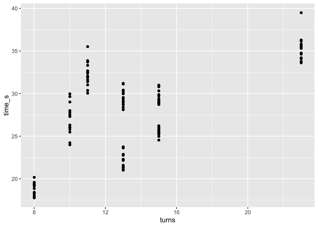
There is actually a fair amount of variability among lap times, with clusters around certain times. Could there be a relationship between the number of turns and the distribution of lap times? Also, some of the race tracks have the same number of turns, and we cannot determine which is which from this graph alone. So I will encode that information with color.
|
|
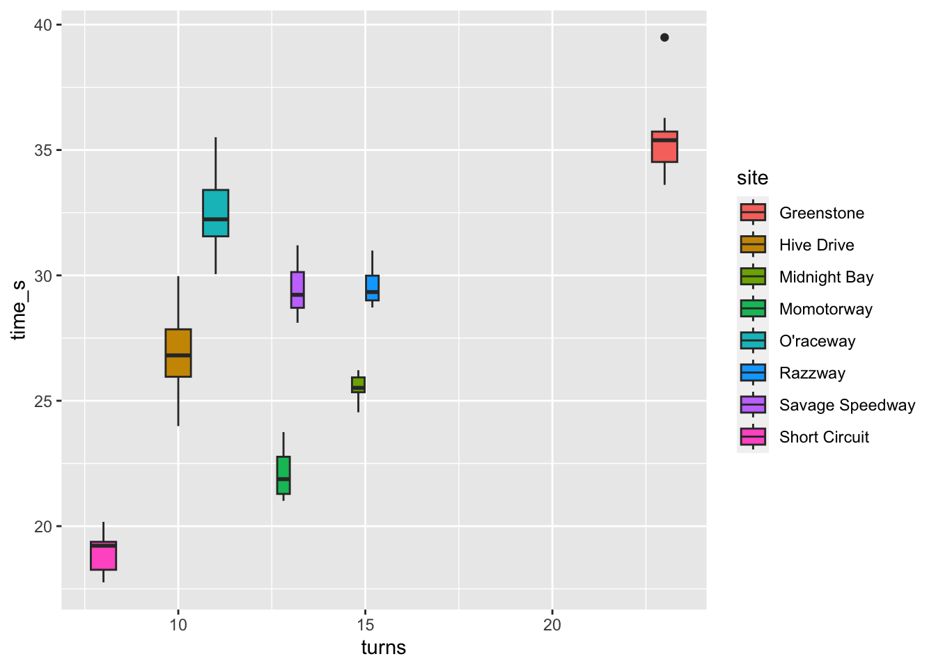
The boxplots give us a numeric summary for the distribution of the points, but different shapes of point distributions can yield the same boxplot. So I will add a violin plot to clarify the shape of how the points are distributed. Also, the turns variable is not really continuous, so I will treat it as an ordered categorical variable.
|
|
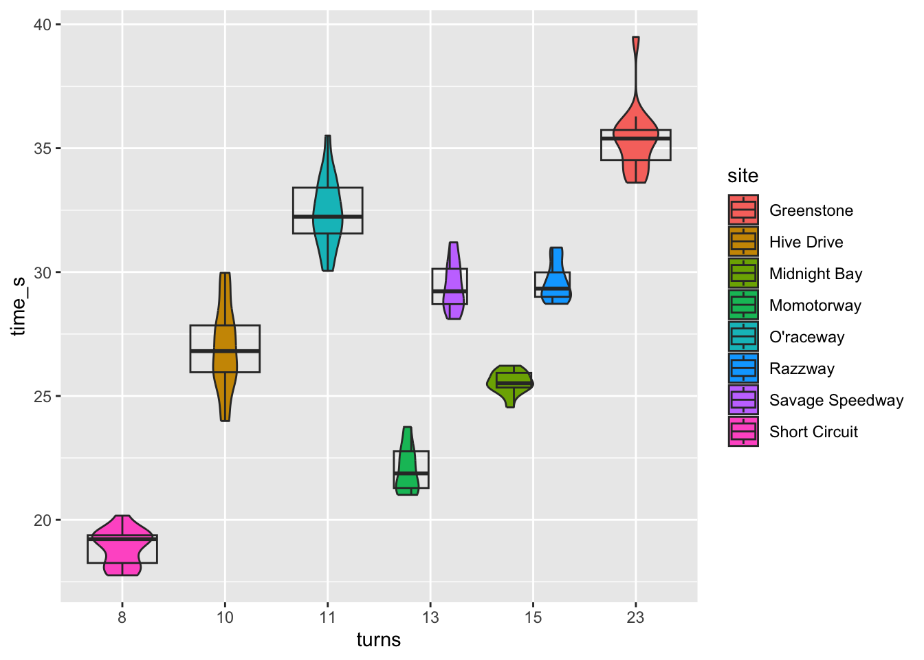
This gives a good idea of how the lap times are distributed both in terms of shape and numerically. But we may also be interested in the individual points themselves, for example, to see if a particular marble is a high or low performer. A raincloud plot would combine all three of these elements.
|
|
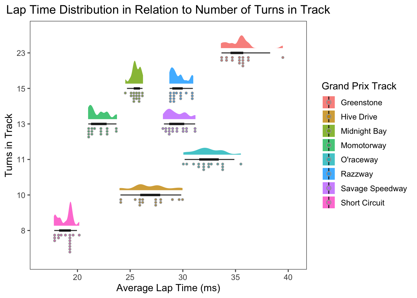
It would be interesting to see how the individual champion of the first season of Marbula One performed on this plot. I will highlight the winner (Speedy of the Savage Speeders) with a red dot.
|
|
Then put the finishing touches on the graphic to make the color scheme colorblind-friendly and use fonts that evoke a racing theme.
|
|
Citations and Resources
- Raincloud Plots Paper
- Raincloud Plots Blog
- Marbula One Open Data Repository
- Dr. Randal Olson’s Blog
ggdistR package
This project was presented in class on 2023-06-05. Slides here