Candlestick Chart (aka Japanese Candlestick Chart)
Example
Description of the TYPE of graph
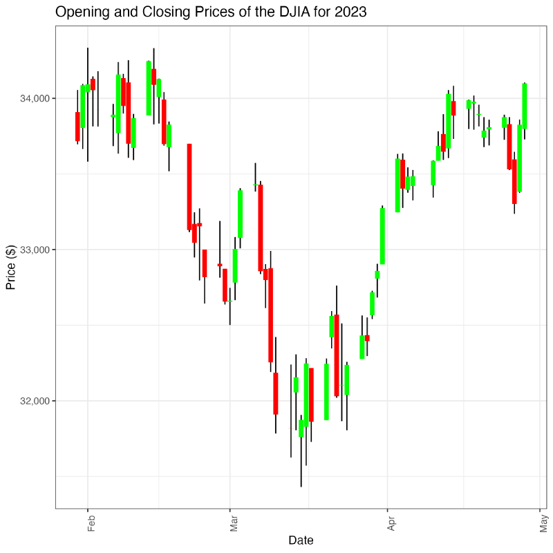
A candlestick chart is a type of chart used to represent the start and end value of a variable over a given time period. It is often used in finance to represent the price movements of some commodity such as a stock, bond, or currency.
Description of the DATA
I found the data that I used in this chart at the Wall Street Journal’s website (here). It covers the opening and closing values of the Dow Jones Industrial Average since the start of 2023. The open, high, low, and close variables are all continuous measures of the DJIA’s price. The date is a discrete ordinal variable.
Representation Description:
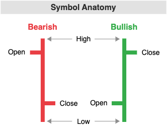
The Candlestick chart is meant to show trends in the value of a variable over time, with aesthetic choices that assist forecasting. A chart consists of a series of vertical bars or “candles.” Each time period (e.g. a day, a week, an hour) in the data is represented by a single candle. Each candlestick shows the starting and ending value for that time period (for example, the opening and closing price of a stock for that day). The ends of the box/body of the candlestick represent the starting and ending values. When the starting value is higher than the ending value, the candlestick is usually filled black or red to indicate a decreasing trend. When the ending value is higher than the starting value, the candlestick is typically colored white or green (positive trend).
Each candlestick has upper and lower “shadows” (lines sticking out of it) that are also called wicks or tails. The wicks/tails represent the highest and lowest values of the time period. For example, the price of a stock may drop and rise throughout the course of trading, and so it may be worth more than its lowest price that day at the end of trading. The length of the wicks or tails helps provide information about the volatility of the measured variable during that period.
 Figure source: https://datavizcatalogue.com/methods/candlestick_chart.html
How to read it & what to look for:
One of the strengths of Candlestick Charts is detecting and predicting trends over time. Different combinations of candle shapes lend themselves to different interpretations. A newer candlestick chart reader should break down the graph into a few key components:
- Look at the color of the body of the candlesticks to see how the value of the variable changed in the 1-unit time period. Did it go up or down?
- How big is the body of the candlestick relative to those on either side of it? A longer body indicates a stronger trend while a shorter body indicates a weaker one.
- Examine the tails or wicks of each candle stick. Longer wicks suggest the variable’s value is more volatile, and vice versa.
- Look at different “runs” of candlesticks to see if there is a continuous trend. For example, if there are several red or black candlesticks in a row with short wicks and bodies, then the value of the variable is trending downwards at a steady pace without much volatility.
Certain applications of candlestick plots will capture other latent meanings. During stock trading, for instance, the length of the wicks may be telling about the market’s psychology or beliefs. A steadily increasing run of green candle bodies but with long wicks and tails may suggest optimism or enthusiasm for an asset, but simultaneously a lack of confidence.
Presentation tips
By convention, candlestick bars are colored green or white (no fill) to indicate an increase in value per unit time while bars are colored red or black to indicate a decrease in value. While the convention for which exact color is used may be changed for aesthetics, inclusion of color is necessary for interpretation. The fill of the candlesticks always encodes its own channel of information.
Other annotations may be used to highlight a particular trend in a given time period, such as whether the value of the variable is going up or down. (This could be stock prices, number of COVID-19 tests ordered by healthcare professionals, amount of blood lactate in an athlete before and after practice, etc.).
Finally, marking the median value of the variable for a 1-unit time period on the candlesticks may help include a little bit more information about the velocity of the volatility within a given time period (i.e. was the increase or decrease sudden?).
Variations and alternatives
Some of the alternatives or variations on this graph are the open-high-low chart](https://datavizcatalogue.com/methods/OHLC_chart.html) (OHLC) and the Kagi chart](https://datavizcatalogue.com/methods/kagi_chart.html). OHLC charts and candlestick charts show the same information, but use right and left tick marks on the high-low volatility line to indicate starting and ending value.
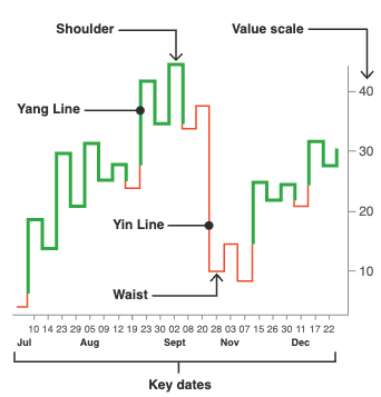
Kagi charts vary in color and line width as they trace the value of an asset/variable over time. They are primarily used to track supply and demand over time for a market good rather than capture the broadstrokes sentiment of the market itself (like a candlestick chart of OHLC).
How to create it/Methods section
Below is the code that I used to load the data and generate the candlestick chart (using R, tidyverse, and ggplot2). I decided to use two geom_segments, one for the high-low volatility line and the other for the opening and closing marks. I layered the high-low volatility line behind the opening and closing marks to better create the tail or wick effect (as if the colored rectangle were the body of a candle).
|
|
Citations
- Candlestick Chart - Learn about This Chart and Tools to Create It. https://datavizcatalogue.com/methods/candlestick_chart.html. Accessed 30 Apr. 2023.
- DJIA | Dow Jones Industrial Average Historical Prices - WSJ. https://www.wsj.com/market-data/quotes/index/DJIA/historical-prices. Accessed 30 Apr. 2023.
- Open-High-Low-Close Chart (OHLC Chart) - Learn about Here. https://datavizcatalogue.com/methods/OHLC_chart.html. Accessed 30 Apr. 2023.
- Kagi Chart - Learn about This Chart and Tools to Create It. https://datavizcatalogue.com/methods/kagi_chart.html. Accessed 30 Apr. 2023.